
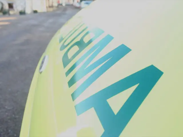
Airline company Brussels rebrands its entire image, maintaining the familiar emblem.
Rebranding an airline with untouchable logos and colors? That's exactly what challenged the team at WeWantMore with Brussels Airlines. The airline had revamped its look in 2021, but it still appeared too distant and corporate, contrasting with the cozy vibe onboard.
In a crowded market where many airlines look alike, standing out is a struggle, and really "owning" a color is next to impossible. But WeWantMore was up for the challenge, centering their designs around the brand essence: "You're in good company," distilled into the concept of "Small nuances, a world of change."
Much like the recent Amazon rebrand and Adobe brand refresh, this update is all about the subtle details. The team zeroed in on a single dot from the existing red dot logo, symbolizing the focus on minute changes that make a big impact.
They fine-tuned the color palette by making it warmer and more polished and revamped the photography style for a clean look with bold pops of signature red. A custom font, Cirrus Sans, was also crafted, drawing inspiration from the golden age of aviation and classic travel posters, adding a hint of nostalgia and elegance to the visual language.
Moreover, WeWantMore unveiled a string of small yet significant adjustments across the brand, ranging from campaigns to inflight communication, interiors, and lounges. By focusing on minute details, the identity now exudes an inviting, Belgian charm, quite like a boutique hotel in the sky (as per a press release).
"The toughest part? We couldn't modify the logo or the colors," recalls Sebastien Greffe, the creative director of WeWantMore. "Yet, a brand isn't merely about form — it's about an idea. We built a visual language, a system, a feeling. That's precisely what we did — not dressing up the brand, but shaping a living identity that's cohesive, meaningful, and palpable in every detail."
"This rebrand isn't merely a superficial layer in advertising, but a truly premium identity that comes to life, from cabin to lounge," says Michel Moriaux, head of product and brand marketing for Brussels Airlines. "Thanks to WeWantMore, we finally have a brand that resonates down to the smallest details, perfectly capturing who we are: warm, welcoming, and unmistakably Belgian with a playful twist."
While it's uncertain how successful an airline's rebrand truly is until it's thoroughly absorbed, it'll be intriguing to see if the airline decides to stick with this new identity. For those wanting to delve deeper into the revamp, head over to WeWantMore's case study page and explore our pieces on British Airways' logo, Korean Air's rebrand, and Japan Airlines' rebrand.
- The rebranding project for Brussels Airlines required the team at WeWantMore to find a way to differentiate the airline in a crowded market, focusing on small nuances that could instigate big change.
- The update centered around the brand essence "You're in good company," with the airline's red dot logo being the starting point for the design.
- The team fine-tuned the color palette, making it warmer and more polished, and revamped the photography style for a clean look with bold pops of signature red.
- A custom font, Cirrus Sans, was created, drawing inspiration from the golden age of aviation and classic travel posters, adding an element of nostalgia and elegance to the visual language.
- WeWantMore unveiled a series of small yet significant adjustments across the brand, including campaigns, inflight communication, interiors, and lounges, aiming to create an inviting Belgian charm.
- The creative director of WeWantMore, Sebastien Greffe, shared that the toughest part was not being able to modify the logo or the colors, yet they built a visual language, a system, and a feeling that permeated every detail.
- The head of product and brand marketing for Brussels Airlines, Michel Moriaux, praised the new identity, stating that it truly captures the essence of the airline: warm, welcoming, and unmistakably Belgian.
- While it's uncertain how successful the rebrand will be until it's thoroughly absorbed by the public, it will be intriguing to see if the airline decides to stick with this new identity, as the industry watches with interest.
